Delivering a scalable data collection system for financial reporting
I led the design of the Member Portal for the Opportunity Finance Network (OFN), transforming fragmented reporting into a unified system with enterprise-grade data management and Power BI integration.

Reporting template
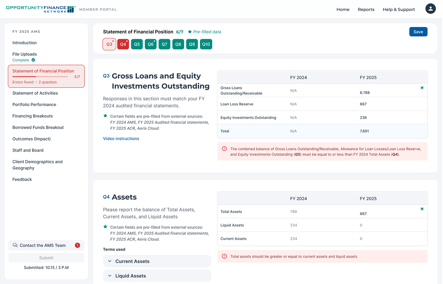
The Annual Member Survey form that member organisations use to submit their financial data. Sections run in a fixed order, answers are pre-filled from external sources such as audited statements, and every question shows its status, so errors are visible before submission.
I designed the template engine behind this form: one structure with built-in validation that OFN can reuse to launch new report types on its own. Pre-fill with full edit access, default values, sequential gating and two-tier alerts catch most errors at input, instead of in manual clean-up by the verification team.
Power BI view
The executive view of submitted data. Survey answers feed Power BI reports inside the portal, for example a peer comparison that sets an organisation against all CDFIs by size and type.
I designed the portal side of the Power BI integration, so members and OFN read the same submitted data in one place instead of in separate exports.

Design system
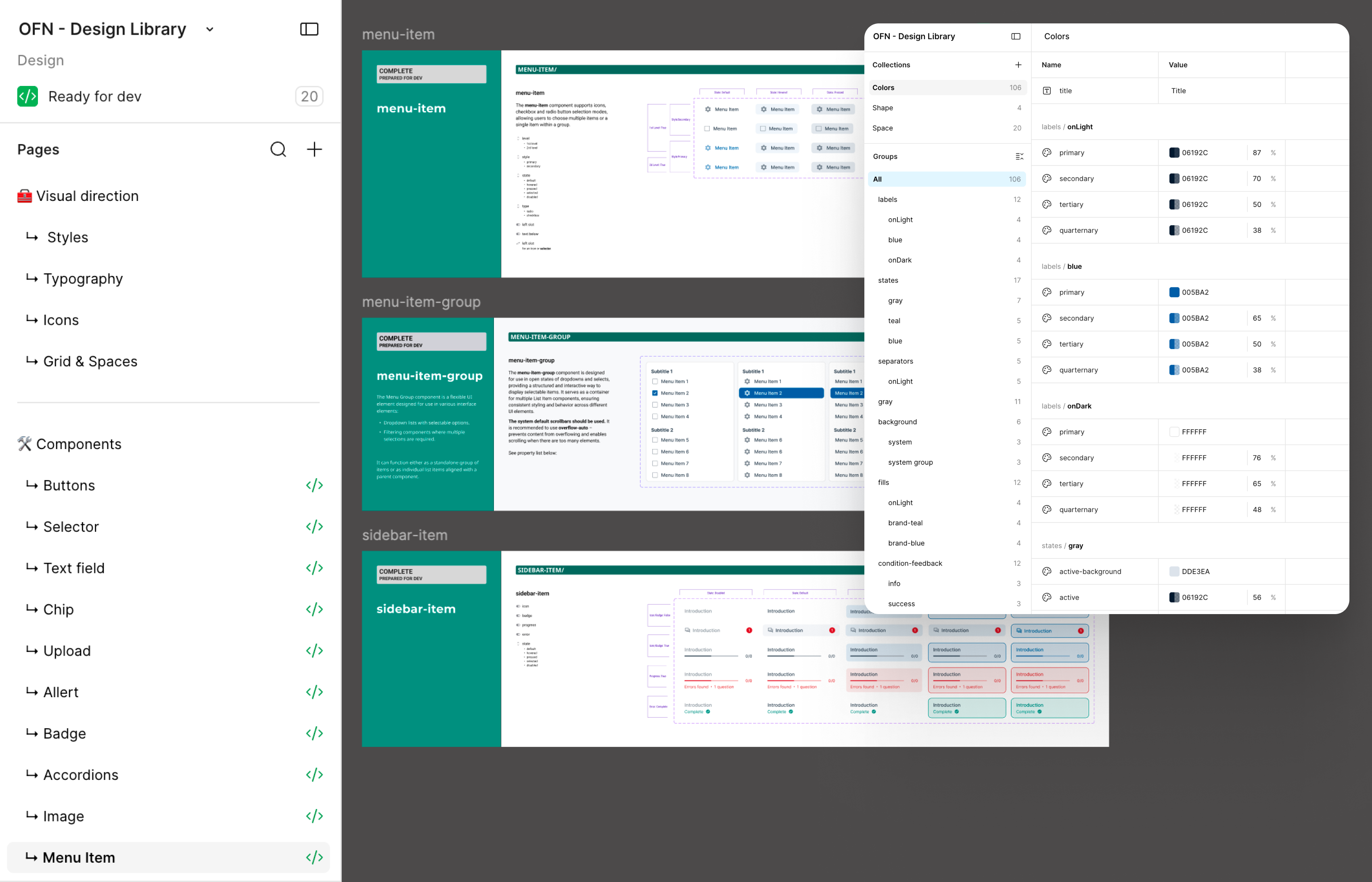
The OFN design system in Figma: visual direction, typography, icons, grid and spacing, and a component library with buttons, selectors, text fields, upload, alerts, menu and sidebar items, each marked ready for dev. On the right is the variable library, with colour tokens grouped by role.
I used MUI as the foundation and extended both layers, tokens and components, with project-specific ones built for OFN's data-heavy interface. Each component documents its states and properties, so developers build from the spec rather than from guesses.

Dev handoff
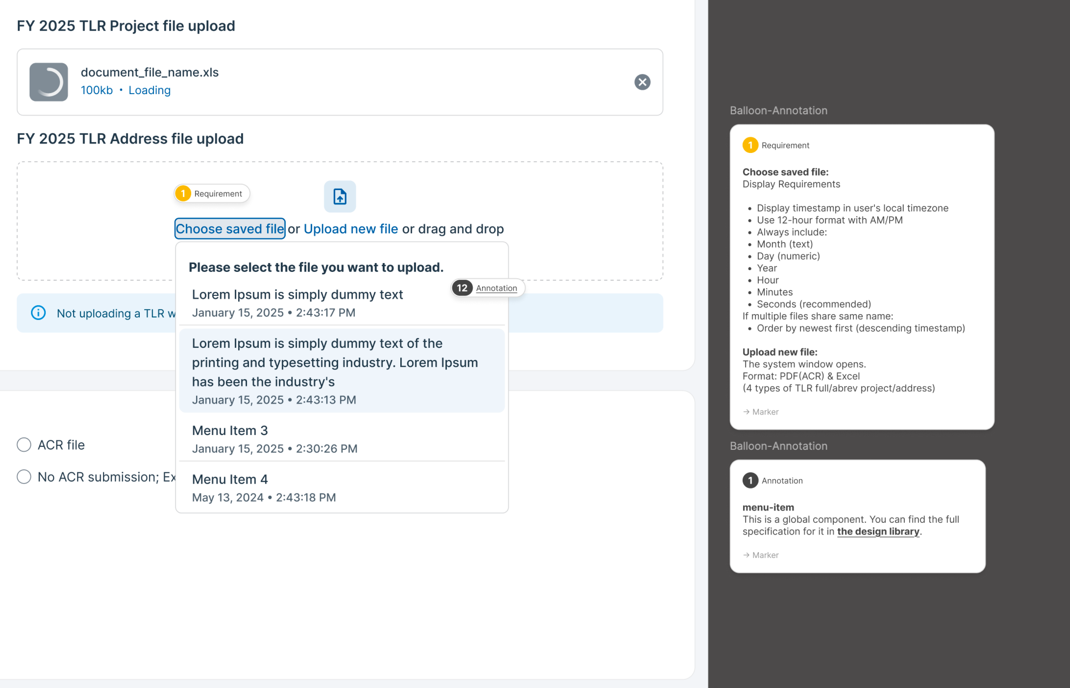
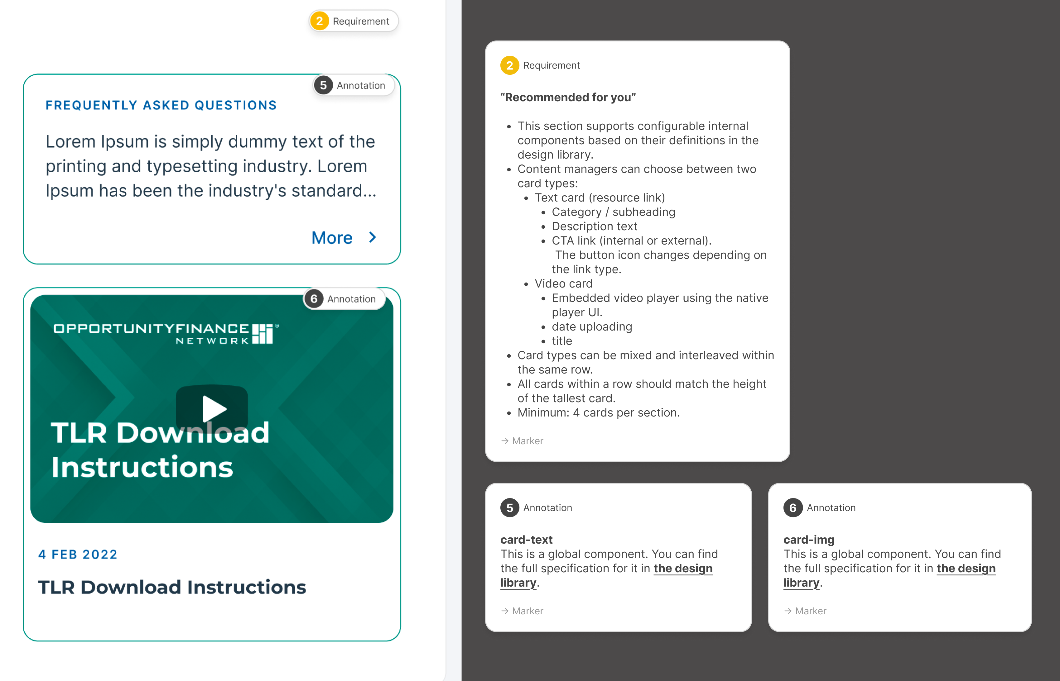
A handoff page for the Help Center cards. Numbered markers tie each part of the layout to a requirement or an annotation: which card types content managers can choose, which fields each card has, how cards mix within a row, and the minimum number per section.
I wrote the CMS rules straight into the design files, so the Drupal components carry their own content rules: variants, required and optional fields, mixing constraints and minimum quantities. With a 195-hour budget, specs this detailed let validation logic and CMS rules ship with minimal back-and-forth.

Member home
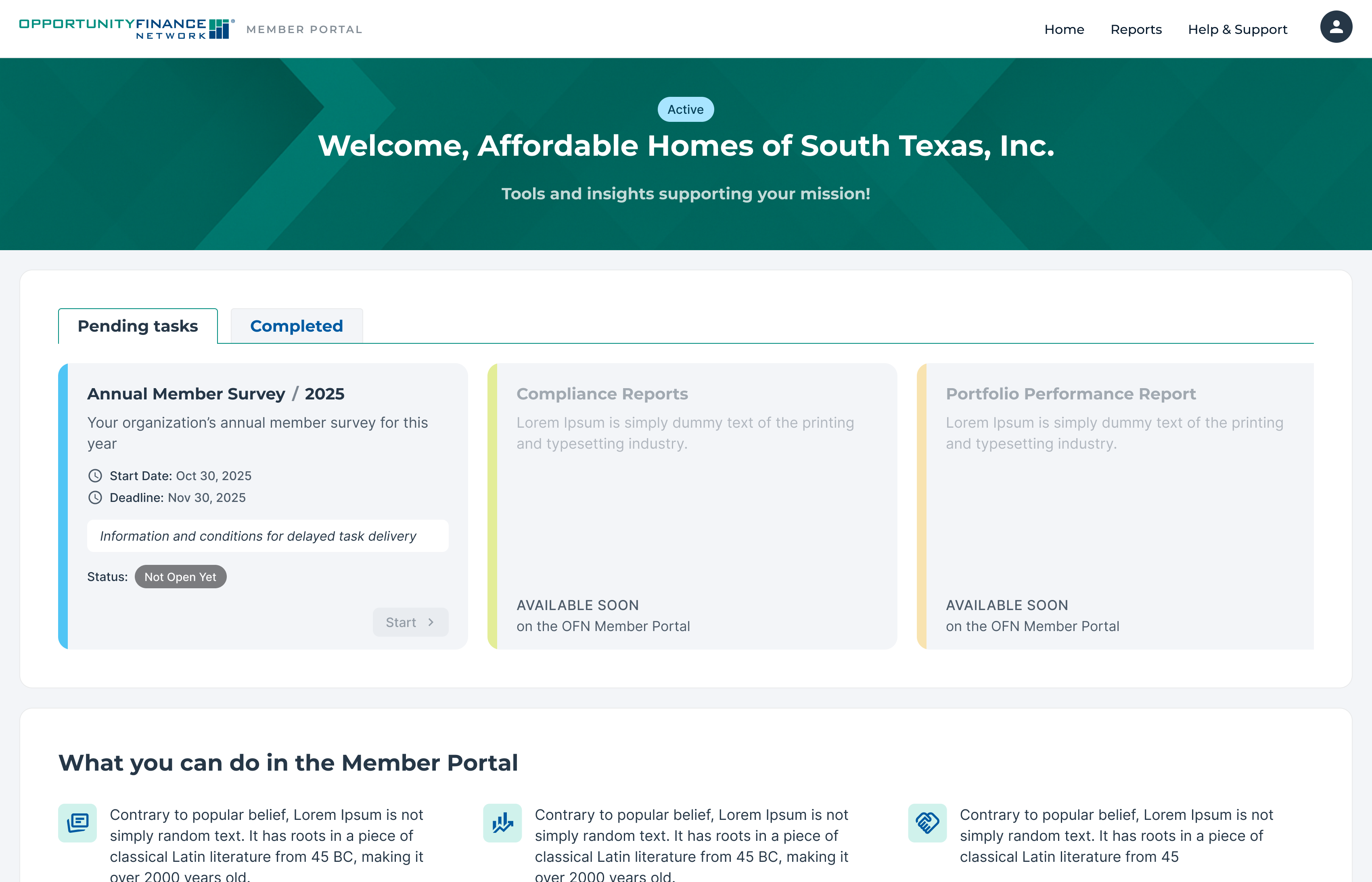
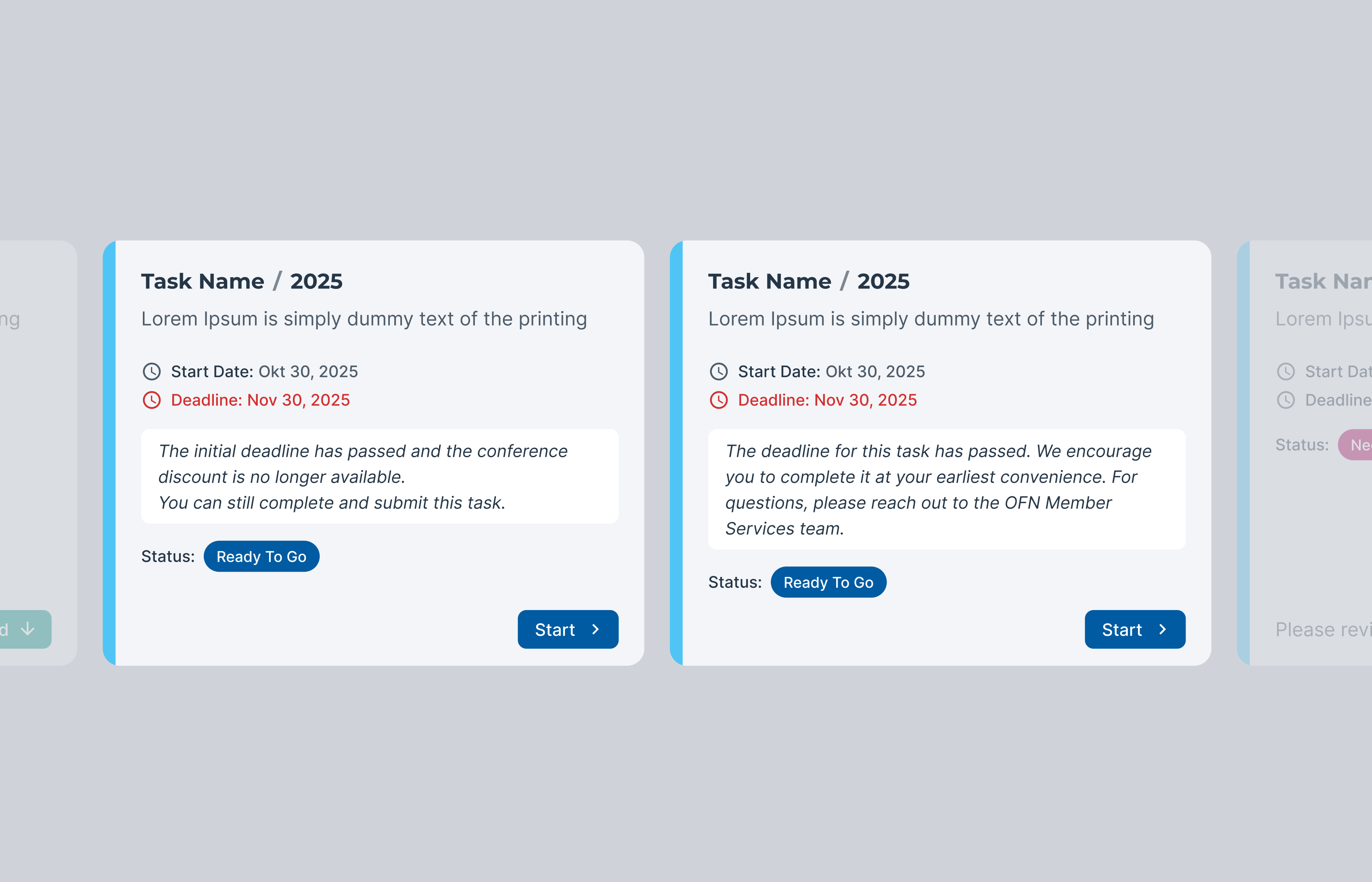
The first screen after sign-in: a personal welcome, pending and completed tasks, and the current Annual Member Survey with its start date, deadline and status. Report types that are not live yet already have their place as “available soon” cards.
I put members’ obligations up front and built placeholders for future report types into the layout, so OFN can switch on new services later without a redesign. Status-transparent cards turn a long, stressful form into a clear next step.

Help center
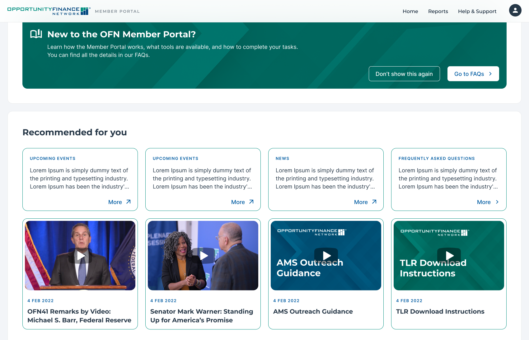
Help and Support inside the portal: an FAQ grouped by topic, short video guides for preparing and uploading files, and plain-language notes on what to upload and why.
I moved help to the point of need. Together with in-form alerts, videos and the glossary, it lets members resolve complex questions where they arise, not in a support ticket.
About the Project
The challenge was to build an intelligent, scalable system rather than just a static interface. I designed a flexible template engine with built-in validation, enabling the client to launch new report types autonomously.
The core business goal was to minimize the operational load on the verification team (AMS), replacing manual "data cleaning".
The Constraint
Skipped formal usability testing in favor of stakeholder validation cycles, accepting risk in edge cases I could mitigate post-launch.
195 hours, decisions over discovery
Under a 195-hour budget, I shifted from traditional discovery to decision-oriented design, using AI tools for rapid prototyping. The goal wasn't to "explore everything" — it was to eliminate ambiguity fast and keep the technical team unblocked.
15% Research Phase
Wireframes as a Strategic Roadmap
AI as a Production Multiplier
Constraint-Based Design (Template System)
Pragmatic Component Reusability
Problem 1: Systemic Errors & User Friction
Qualtrics' non-linear, fragmented structure caused users to "drown" in errors. The verification team (AMS) was overwhelmed by manual clean-up and negative feedback.
Problem 2: Rigid Architecture & Lack of Control
The client couldn't implement new business rules or evolve the product without starting from scratch.
Collaboration & system delivery
195 hours leaves no room for back-and-forth. I worked directly with the System Architect, translating UX into technical requirements detailed enough that validation logic and CMS rules shipped with minimal iterations.